
And anyone with access to the internet and a basic knowledge of Microsoft Excel can check for themselves. Here’s how you do it.
First, go to the Wikipedia page on firearm death rates in the United States. If you don’t like referencing Wikipedia, then instead go to this study from the journal Injury Prevention, which was widely sourced by media on both the left and right after it came out, based on a survey of 4000 respondents. Then go to this table published by the FBI, detailing overall homicide rates, as well as gun homicide rates, by state. Copy and paste the data into Excel, and plot one versus the other on a scatter diagram. Alternately, do the whole thing on the back of a napkin. It’s not hard. Here’s what you get:

This looks less like data and more like someone shot a piece of graph paper with #8 birdshot.
If the data were correlated, we should be able to develop a best fit relationship to some mathematical trend function, and calculate an “R^2 Value,” which is a mathematical way of describing how well a trendline predicts a set of data. R^2 Values vary between 0 and 1, with 1 being a perfect fit to the data, and 0 being no fit. The R^2 Value for the linear trendline on this plot is 0.0031. Total garbage. No other function fits it either.
I embellished a little with the plot, coloring the data points to correspond with whether a state is “red,” “blue,” or “swing,” according to the Romney-Obama era in which political demarcations were a little more even and a little more sensical. That should give the reader a vague sense of what the gun laws in each state are like. As you can see, there is not only no correlation whatsoever with gun ownership rate, there’s also no correlation whatsoever with state level politics.
But hey, we are a relatively unique situation on the planet, given our high ownership rates and high number of guns owned per capita, so surely there’s some supporting data linking gun ownership with gun homicide elsewhere, right?
So off we go to Wikipedia again, to their page listing countries by firearm related death rates. If Wikipedia gives you the willies, you’re going to have a harder time compiling this table on your own, because every line in it is linked to a different source. Many of them, however, come from www.gunpolicy.org. Their research is supported by UNSCAR, the UN Trust Facility Supporting Cooperation on Arms Regulation, so it is probably pretty reasonable data. They unfortunately do not have gun ownership rates, but do have “guns owned per 100 inhabitants,” which is a similar set we can compare against. And we drop that into Excel, or use the back of our napkin again, and now we are surely going to see how gun ownership drives gun homicide.

Well that’s disappointing.
Remember we are looking for an R^2 value close to 1, or hopefully at least up around 0.7. The value on this one is 0.0107. Garbage. But there’s a huge number of data points parked down around the bottom of the graph, so perhaps we can break that out into separate graphs and just look at the violent countries and the peaceful countries separately.
(Please ignore the nerd in the back asking for the Y axis to be shown on a log-scale, as that will just confuse the muggles)

Well, that didn’t work. R^2 = 0.0097. How about for countries with high homicide rates?
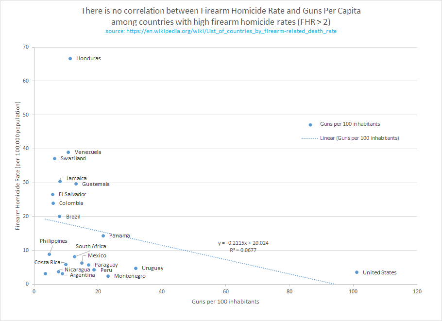
Oh boy.
R^2 = 0.0677. But how about in Europe, where everything is perfect and there aren’t any guns? Those guys and gals over there have totally got this thing figured out, or so I’m led to believe.

R^2 = 0.0184.
Garbage.
No correlation whatsoever.
So let’s briefly recap. Gun Murder Rate is not correlated with firearm ownership rate in the United States, on a state by state basis. Firearm Homicide Rate is not correlated with guns per capita globally. It’s not correlated with guns per capita among peaceful countries, nor among violent countries, nor among European countries. So what in the heck is going on in the media, where we are constantly berated with signaling indicating that “more guns = more murder?”
One: They’re sneaking suicide in with the data, and then obfuscating that inclusion with rhetoric.
This is the biggest trick I see in the media, and very few people seem to pick up on it. Suicide, numerically speaking, is around twice the problem homicide is, both in overall rate and in rate by gun. Two thirds of gun deaths are suicides in the USA. And suicide rates are correlated with gun ownership rates in the USA, because suicide is much easier, and much more final, when done with a gun. If you’re going to kill yourself anyway, and you happen to have a gun in the house, then you choose that method out of convenience. Beyond that, there’s some correlation between overall suicide and gun ownership, owing to the fact that a failed suicide doesn’t show up as a suicide in the numbers, and suicides with guns rarely fail.
Accidents are a relatively small portion of total gun deaths, but obviously that entire chunk of the numbers happen to people who own guns. Can’t die of a gun accident without a gun.
So when you include both of those factors in your data set, you end up with a positive correlation for this new quantity you’ve brewed up, called “gun deaths.”
These charts then show up as infographics in places like this Mother Jones Article, down under “Debunking Myth #2.” (If you don’t want to follow the link, the image is reposted in a section below. The big yellow one.) Notice the label on the Y axis? “Gun deaths per 100,000 residents” includes suicides and accidents. Also it technically includes police shootings and such.
That is not to belittle the suicide problem. Suicide is twice the problem that homicide is, statistically speaking, but you’re not going to fix that by any of the “common sense measures” the left floats, such as magazine size restrictions. (pro tip: you only need a mag of “1” to shoot yourself) Nor is it to belittle the accident problem, which is itself tremendous. Much could be done to ameliorate both of those problems.
Two: They’re cooking the homicide data.
The most comprehensive example of this is probably this study from the American Journal of Public Health. It’s widely cited, and was very comprehensive in its analytical approach, and was built by people I admire and whom I admit are smarter than me. But to understand how they ended up with their conclusions, and whether those conclusions actually mean what the pundits say they mean, we have to look at what they actually did and what they actually concluded.
First off, they didn’t use actual gun ownership rates. They used fractional suicide-by-gun rates as a proxy for gun ownership. This is apparently a very common technique by gun policy researchers, but the results of that analysis ended up being very different from the ownership data in the Injury Prevention journal in my first graph of the article. The AJPH study had Hawaii at 25.8% gun ownership rate, compared to 45% in IP, and had Mississippi at 76.8% gun ownership rate, compared to 42.8% in IP. Could it be that suicidal people in Hawaii prefer different suicide methods than in Mississippi, and that might impact their proxy? I don’t know, but it would seem to me that the very use of a proxy at all puts the study on a very sketchy foundation. If we can’t know the ownership rate directly, then how can we check that the ratio of gun suicides properly maps over to the ownership rate? Further, the fact that the rates are so different in the two studies makes me curious about the sample size and sampling methods of the IP study. We can be absolutely certain that at least one of these studies, if not both of them, are wrong on the ownership rate data set. We know this purely because the data sets differ. They can’t both be right. They might both be wrong.
Second, they didn’t look only at guns. They looked at a wide array of possible factors that would influence gun homicide, and controlled against them in a complex, multivariate analysis. Generally, I would characterize this as the proper approach. Here is a quote from the study:
We controlled for the following factors, which have been identified in previous literature (29,32,34–37,41–45,54,56,57) as being related to homicide rates: proportion of young adults (aged 15–29 years), proportion of young males (aged 15–29 years), proportion of Blacks, proportion of Hispanics, level of urbanization, educational attainment, poverty status, unemployment, median household income, income inequality (the Gini ratio), per capita alcohol consumption, nonhomicide violent crime rate (aggravated assault, robbery, and forcible rape), nonviolent (property) crime rate (burglary, larceny–theft, and motor vehicle theft), hate crime rate, prevalence of hunting licenses, and divorce rate. To account for regional differences, we controlled for US Census region. In addition, to capture unspecified factors that may be associated with firearm homicide rates, we controlled for the annual, age-adjusted rate of nonfirearm homicides in each state. We also controlled for state-specific incarceration rates and suicide rates. The definitions and sources of these data are provided in Table 1.
The results of their multivariate model were that six factors influenced homicide rate, not one. Let’s go down that list.
· For each 1 percentage point increase in proportion of household gun ownership [via gun suicide proxy], firearm homicide rate increased by 0.9%
· For each 1 percentage point increase in proportion of Black population, firearm homicide rate increased by 5.2%
· For each 0.01 increase in Gini coefficient [income inequality], firearm homicide rate increased by 4.6%
· For each increase of 1/1000 in violent crime rate, firearm homicide rate increased by 4.8%
· For each increase of 1/1000 in nonviolent crime rate, firearm homicide rate increased by 0.8%
· For each increase of 1/10 000 in incarceration rate, firearm homicide rate decreased by 0.5%
So let’s start by clearing the air. The two primary correlations they found were not guns, they were income inequality and black population ratio. Does this mean that we can reduce firearm homicide by getting rid of black people?
No.
No it does not.
Don’t even go there.
The reason we don’t go there is very important to understand. The study established correlations, not causality. The results might be explained by saying “black people tend to live disproportionately in poorer, urbanized areas that are more prone to homicide due to environmental factors.” That explanation may be completely reasonable. If, on the other hand, someone pointed at this study and said, “Black people are clearly the cause of homicide, we need to get rid of black people,” that would not only be a racially prejudiced statement, it would be illogical, because causality has not been shown.
But that also may mean “gun owners tend to live disproportionately in poorer, urbanized areas that are more prone to homicide due to environmental factors.” That could even be why they bought the gun. When a media source such as Mother Jones or Everytown for Gun Safety implies that “we have a gun problem,” they are making exactly the same reasoning error as if they said, “we have a black people problem.”
And black population was six times more predictive than gun ownership was, in the AJPH model.
Of course, all of that presumes you believe fractional firearm suicide rate is an accurate proxy for gun ownership rate. While that may be true, all the AJPH study technically showed was a link between firearm homicide rate and the ratios of suicide committed with a firearm compared to other methods. And presuming you do buy it, gun ownership is one sixth as predictive as being black, when it comes to homicide, which is to say it’s not very predictive at all. And that’s why the scant correlation doesn’t show up in my first graph in the article.
Applying the Lesson
So now that you have a more complete toolkit to understand how the media is warping the narrative, let’s take a look at a typical left media hit piece. Vox does a lot of these, and spends a tremendous amount of time on very carefully and very viciously mangling data and graphs to support them, which is a bit of a tragedy because their graphical presentation is beautiful, and I quite enjoy their articles on other topics. Here’s a recent article, although they pretty much have a series of stock articles they release after each mass shooter event that hits the media, so the next one they drop will assuredly look very similar to the last one.
(author’s note: The article we critique here languished on the internet for three years, from the fall of 2015 until November 2018, when they made a stealth change to the material in it to include the words “and suicides” in the section we’re critiquing. It may have been changed due to the popularity of this Medium piece, or not, it’s hard to say. You can pull the original from the internet wayback machine here. The critique here stands as an example of the vicious games the media play with not only the gun topic, but all topics.)
Their first graphic:

…looks nice. But it doesn’t look like any of my graphs at all. Why? Well for one, the data is different, but it’s not too different, so let’s explain that criticism with sourcing issues. The main difference here, is they’re leaving off data they don’t want you to see. Guns-per-capita varies widely across these data points. Certainly the USA tops the list, but Switzerland at 24 guns per 100 inhabitants has five times more homicides than New Zealand at around 30 guns per 100 inhabitants. Germany has around 30 guns per 100 inhabitants and they’ve got a gun homicide rate that’s a third of Belgium’s, who only have around 17 guns per 100 inhabitants. So Vox has a nice graph here, but they’re intentionally omitting data that would unravel their case.
Further, they’re excluding data points. The USA is #10 in “Human Development Index” according to the current rankings as of March 2018. Norway and Iceland are ahead of us on the HDI rank, but are missing from the graphic. Curiously, both of these countries have over 30 guns per 100 inhabitants as well.
So let’s pause for a moment, purely because this is pretty fun, and look at that HDI list. Norway (31.3 guns per 100 inhabitants), Switzerland (24.5 guns per 100 inhabitants), Germany (30.3 guns per 100 inhabitants), Iceland (30.3 guns per 100 inhabitants) and Canada (30.8 guns per 100 inhabitants) are all higher than the USA on the list, making it six of the top ten HDI ranked countries at over 24 guns per 100 inhabitants. There are only 15 countries in the world with gun ownership rates this high, and 6 are in the top ten of HDI rank.
Let’s look further down, and they’ve got that same Mother Jones “more guns more deaths” graph I mentioned earlier. You can see clearly how it intentionally warps the data by including suicides and accidents, by comparing it to my first graph in this article.

Note the subtle rhetorical bait and switch. First Vox initiates a very noticeable, very specific conversation about homicide, while leaving the “ownership” data out, and then they subtly switch to a graph which is dominated by suicide numbers without mentioning the word “suicide” once, to make you think they’re still talking about homicide, when they actually aren’t. Then they follow that graph up immediately with this one:

Well heck, that’s just like my second, third, fourth, and fifth graphs up at the top! How did they get a positively correlated trend line when I didn’t? Three ways.
One: This graph has also snuck suicide, accidents, police shootings and such in the back door, without alerting the reader of the bait and switch.
Two: This graph is leaving out a whole bunch of countries, carefully and selectively omitted to funnel the data into a trend.
Three: this graph is leaving out the most important number on the whole thing, which is the R^2 number. What level of correlation we have in this data is absolutely unclear. The only thing that actually draws your eye to believe in a correlation is the trendline itself. If you hide the USA for a moment, and erase the trendline, the data looks like a big uncorrelated mess. If you strip out suicide and accidents, it will become even more uncorrelated. If you add in all the countries they left out, you get an exact replica of my second graph in this article, which shows no correlation.
These are the tricks being played. The only way to even engage in this dialog rationally is to understand how the tricks work and keep an eye out for them. Especially when reading Vox, Mother Jones, Everytown for Gun Safety, and by transitive property, MSNBC, CNN, and the majority of the Blue Church sources, who use Everytown and such as blindly trusted sources when they publish their hastily thrown together articles on gun violence in the wake of one of our seemingly semi-annual yet statistically insignificant school shooting incidents.