

My colleagues at Open Source Defense and I were recently pointed to a pretty amazing Geographic Information Systems (GIS) project hosted by The Oregonian, which uses CDC data and population rate data to determine the gun deaths rate, gun homicide rate, and gun suicide rate within the country on a county-by-county basis. They used data from 2004 through 2010 to have enough data to apply meaningfully to counties with sparse populations. They produced an interactive website, where you can zoom in to any area of the country. Anyone can go to the website itself and zoom in or around any of the maps in this article, to look at them yourself, and we encourage you to do so — don’t just take our word for it.
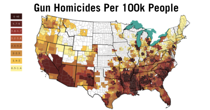
The RST map shows big swaths of red in the generally “red state” areas of the country, and most of the social media dialogue I’ve tracked on these maps boils down to red-state political bashing and gun bashing. But there are very important things to be gleaned from the following two maps, which disaggregate the deaths by homicide and suicide.
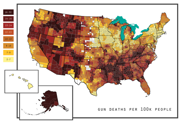
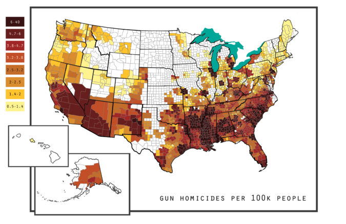
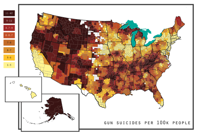
Gun suicides account for about two-thirds of gun deaths, so this map is going to look generally like the RST one. No huge surprises here. But there are many regions red in the “gun deaths” map that show blue in the “suicide” map, and the reason why is clear when you look at the “homicide” map here: Note, that in this version, we’ve changed the colors from the original website, in order to make the maps easier to read — the information they contain is the same. Look at the differences between gun homicides and gun suicides.
We hear a lot of banter from the “anti-gun” media that these problems are gun problems, and they’ve concocted this “gun deaths” number in order to lump these into the same problem and gloss over the differences. But if the problem were “guns,” then the hot spots on the suicide map and the hot spots on the homicide map would coincide, and would be related to gun ownership rates. There are only a few places where they overlap. Most of the hot zones for suicide have low homicide rates, and most of the hot zones for homicide have low suicide rates. The difference is stark. Let’s zoom in. Gun suicide is a California problem north of Sacramento. Gun homicide is a problem south of it. We see a geographic boundary that runs through Reno, Sacramento, and San Francisco where suicides are a problem to the north, and homicides are a problem to the south. I hear it’s nice in San Diego, and these maps confirm it.
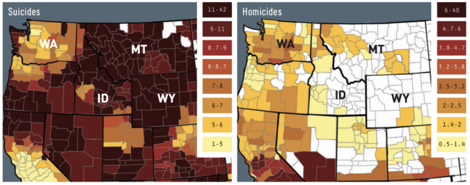
Washington State has generally low homicide rates and suicide rates, out-side of a stretch along the Pacific coast. But anyone who has driven through Washington State knows that the character of the land, and the people, shifts around Spokane and starts to align more with the sorts of folks you meet in Idaho, Montana, and Wyoming. Here gun homicides start to drop and approach zero, while suicides jump into the highest per-capita category. The exact same effects can be seen when you finish your drive eastward and land in Minnesota and the Great Lakes states:
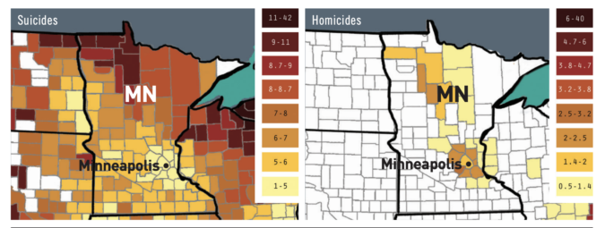
Minneapolis has rates of both that equate to central and western Washington, and also has similar demographics. But once you get off into the rural areas to the north and east such as Michigan, the gun suicide rates jump significantly, and the gun homicide
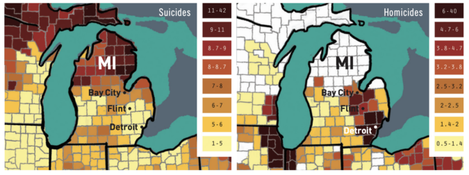
rates crater to zero. It’s obviously not “the guns” there either. The difference in Michigan is tremendous, look at this: There’s basically a horizontal map line at 44 degrees latitude that bisects the peninsula, north of which we have zero gun homicide and lots of gun suicide, and below which we have … Bay City, Flint, Detroit, etc. It’s not the guns here.
Look at Maine and Vermont: gun deaths by homicide are generally homogeneously low across New England, but gun suicide rates spike in Maine. And gun homicide rates crater in northern Vermont and southeastern Maine, where suicide rates are high.
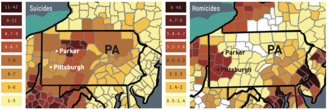
Check out Pittsburgh: The counties to the east and north of Pittsburgh fit together like a puzzle piece. We see another one of these geographic boundaries, right down the Allegheny river where the problem flips in Parker, Pennsylvania. Other rivers mark similar boundaries. It’s uncanny.
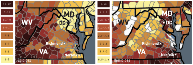
Maryland, DC, and Virginia: Gun homicides in DC and Baltimore are high, suicides are low. Drive west and it flips. Drive south and it flips too, at least until you get to Richmond, after which it flips back. The stretch from Richmond to Norfolk and Virginia Beach is high homicide, low suicide.
West Virginia is kind of a mess.
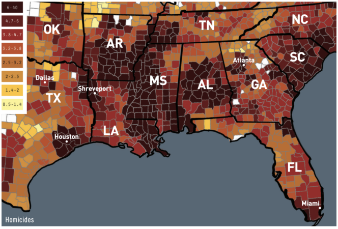
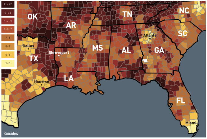 Look at the South overall: This pattern we see of hot red zones in suicide flipping to blue zones for homicide, and vice versa, happens all across the South. The Mississippi Valley is a great example — very hot on homicide all through the stretch, but only a few hot pockets for suicide. Shreveport generally sucks “because Shreveport,” but your major metro areas such as Houston, Dallas, and Atlanta have the now-familiar inversion — high homicide, low suicide, surrounded by areas with the opposite trend. Central and south Florida is another example of this puzzle piece behavior.
HOW DO WE EXPLAIN HOMICIDE?
How on earth is any of this possible? It certainly doesn’t fit the “it’s the guns” narrative. If it were “the guns,” then these hot spots would mostly overlap. There are a few overlaps (sorry Shreveport, sorry Coal Country), but most of the country exhibits the exact opposite behavior to what we’d expect from the “it’s the guns” hypothesis.
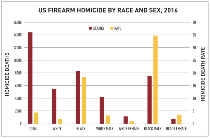
Let’s dig a bit. I pointed out over a year ago in some of my own blog writing at Handwaving Freakoutery that the main problem with homicide, demographically speaking, was within the black community, and the rate data for this is horrifying:
Rates in the maps above are red/blue, rates in this bar chart are yellow. The black male firearm homicide victimization rates are 35 times that of white women. They are the ones getting shot. How does that match our maps above? Below is a rust belt comparison for homicide: The second image presented comes from “the Racial Dot Map,” from the Cooper Center at the University of Virginia, visible at demographics. coopercenter.org/racial-dot-map. It’s also interactive and allows you to zoom around on your computer. When viewed online, green dots in the second map are black folks. This is relatively self- explanatory, and ts with the overall demographic rates expressed in the bar chart above. Gun homicide in the
United States is largely a poor black problem. Characterizing it as an urban problem wouldn’t be correct, however, and you can see why in Mississippi:
A lot of green east of the Mississippi River, not a lot of big cities. (This is easier to see at the website itself, go try it.) This isn’t explicitly an urban black problem; it’s a poor black problem. At this point, we’re inclined toward a simple explanation. Poor black folks have a gun homicide problem, while poor white folks have a gun suicide problem. And I think that’s generally accurate, but there are problems with applying the socioeconomic explanation to suicide.
HOW DO WE EXPLAIN SUICIDE?
The gun suicide hot zone begins in the west half of Virginia, stretches through Appalachia, Kentucky, Tennessee, Oklahoma, and then makes a bit of a downward turn into Texas. Like an arc. There are plenty of poor white folks outside of Savannah, Tallahassee, much of South Carolina, and in other pockets of the Deep South that are poorly populated and have below-average suicide rates. But the states of Kentucky and Tennessee are basically a wall of red in the suicide map outside a couple of metro areas. As a Southerner myself, I’m reminded that there are really two kinds of “The South” — the Appalachian South, and the Deep South, which have different cultural character because of who settled them.
Have a gander at this map, from Colin Woodward’s work on “The 11 Nations of America.” The correlation with his
map is uncanny: The break between systemic rearm suicide and sporadic rearm suicide within the South is almost directly fore-
told by the boundaries between Greater Appalachia and the Deep South. The line where it begins in Virginia and North Carolina is right at the boundary between Greater Appalachia and the Tidewater. Let’s look bigger picture: The eastern boundary of rearm suicide down the central spine of the country follows almost directlythe boundaries of “The Far West” in Woodward’s map. What was Woodward on about when he cooked up this map, which is so alluringly predictive of the gun suicide boundaries in the country?
Woodward’s map comes from a book he authored, titled American Nations: A History of the Eleven Rival Regional Cultures in North America. I might hastily and sloppily summarize his thesis thusly. Different regions of the country abide by measurably different value structures, purely because of who landed where on boats, and from which regions those boats sailed, for whatever reasons. Each landing zone carried with it a specific bundle of genes and indoctrinations that spread westward as those colonies did what colonies do, that being colonizing, carrying those genes and indoctrinations with it. And he thinks you can identify where the regions exist today, by running voting patterns through a Geographic Information System (GIS) software package, which would then spit out his map above.
Put even more hastily and sloppily, gun deaths by homicide and by suicide are different behaviors, and behaviors are functions
of culture. More recently, Woodward graced the online publication Medium with a look specifically at the DNA components of this map. Literal genetic differences. His take unpacks a study by Eunjung Han and others from the academic journal Nature Communications in February of 2017, which analyzed the genomes of 770,000 genotyped U.S. residents, to create a historical portrait of colonization and expansion behavior of North American residents, be they settlers, slaves, or immigrants. This map comes from that Nature Communications study:
From Han, E. et al. Clustering of 770,000 genomes reveals post-colonial population structure of North America. Nature Communications 8 (2017). And that’s an aspect of the rearm deaths debate very few people have touched, or are even willing to touch. Are rural whites in Kentucky more genetically predisposed to suicide than rural whites in South Carolina? Studies in the academic community do seem to indicate a link between genes and suicide. How explanatory that genetic link is for rearm suicide rates is, as far as I’m aware, totally unstudied. I categorically refuse to speculate, because the implications of that sort of thing would be vast and could be seriously misused by political actors with questionable intent.
What I can say, from grinding on these GIS maps for several days, is that “gun deaths” as defined are a deeply cultural problem, and only slightly (if at all) related to gun availability. Not just for homicide, but for suicide as well. Further, the makeup of our country is so different from other countries that comparisons between them and us are fraught with confounders. Most importantly, in a country where firearms are never going to be magically evaporated, with a guns-per-capita rate far beyond the saturation point of easy availability, we must seek cultural solutions to cultural problems.